Work
Client Work
Branding
VISA (Authorize.NET)

Objective
The Authorize.net Brand Redesign was initiated to modernize and unify the company’s visual identity while aligning it with its sister brand, Cybersource, which had recently undergone a redesign. The objective was to create a refreshed, scalable design system that reflected trust, innovation, and simplicity, while maintaining consistency across customer touchpoints in the marketplace.
 |  |
Old | New |
What we've done
As Senior Visual Designer, I owned the full rebrand execution, including:
Logo Design – creating a refreshed logo that balanced legacy recognition with a modernized look.
Logo Usage Systems – establishing rules and standards for scalable and consistent usage across platforms.
Color Schemes & Typography – designing a new palette and type hierarchy that complemented Cybersource while giving Authorize.net its own distinctive presence.
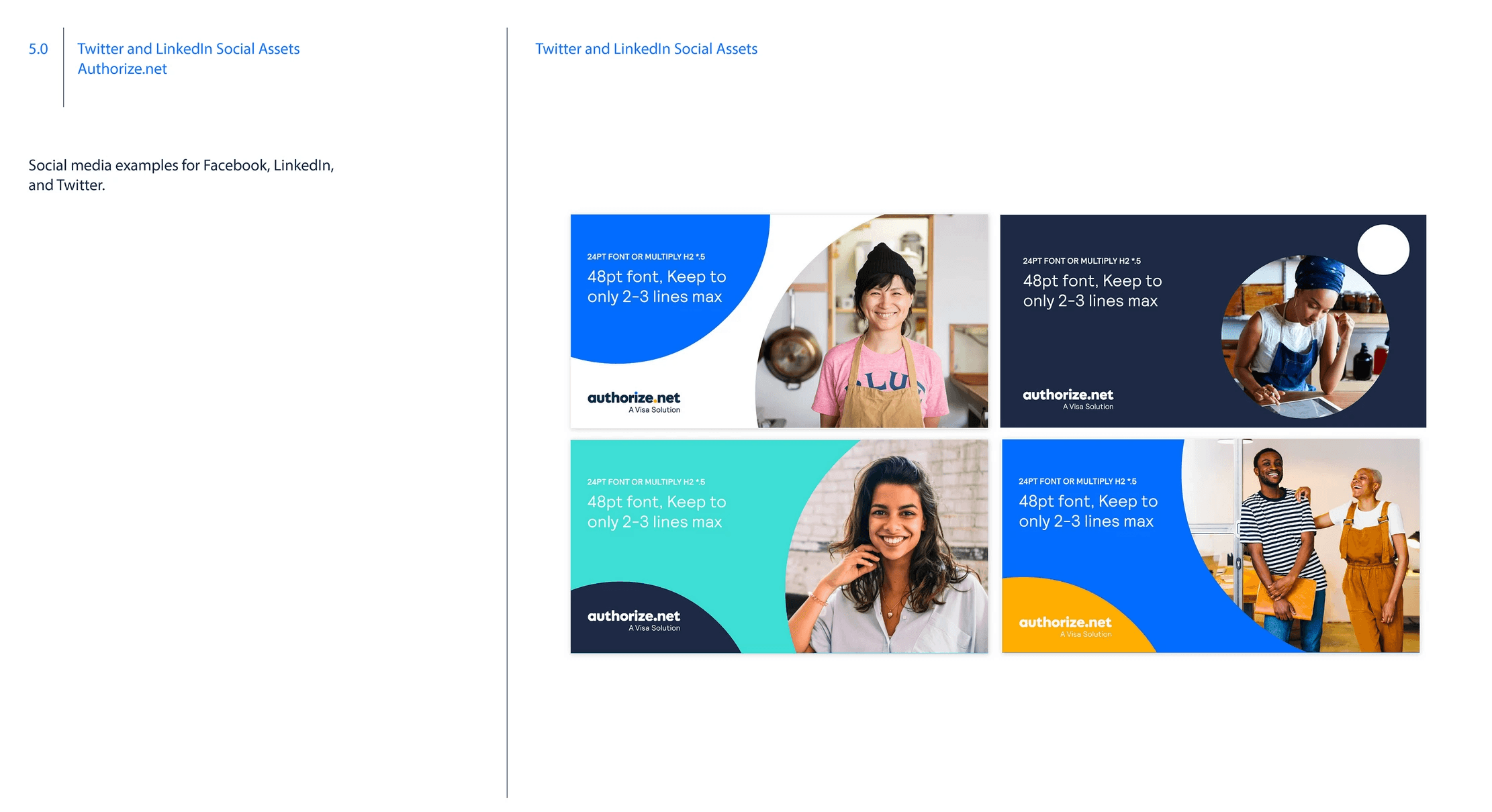
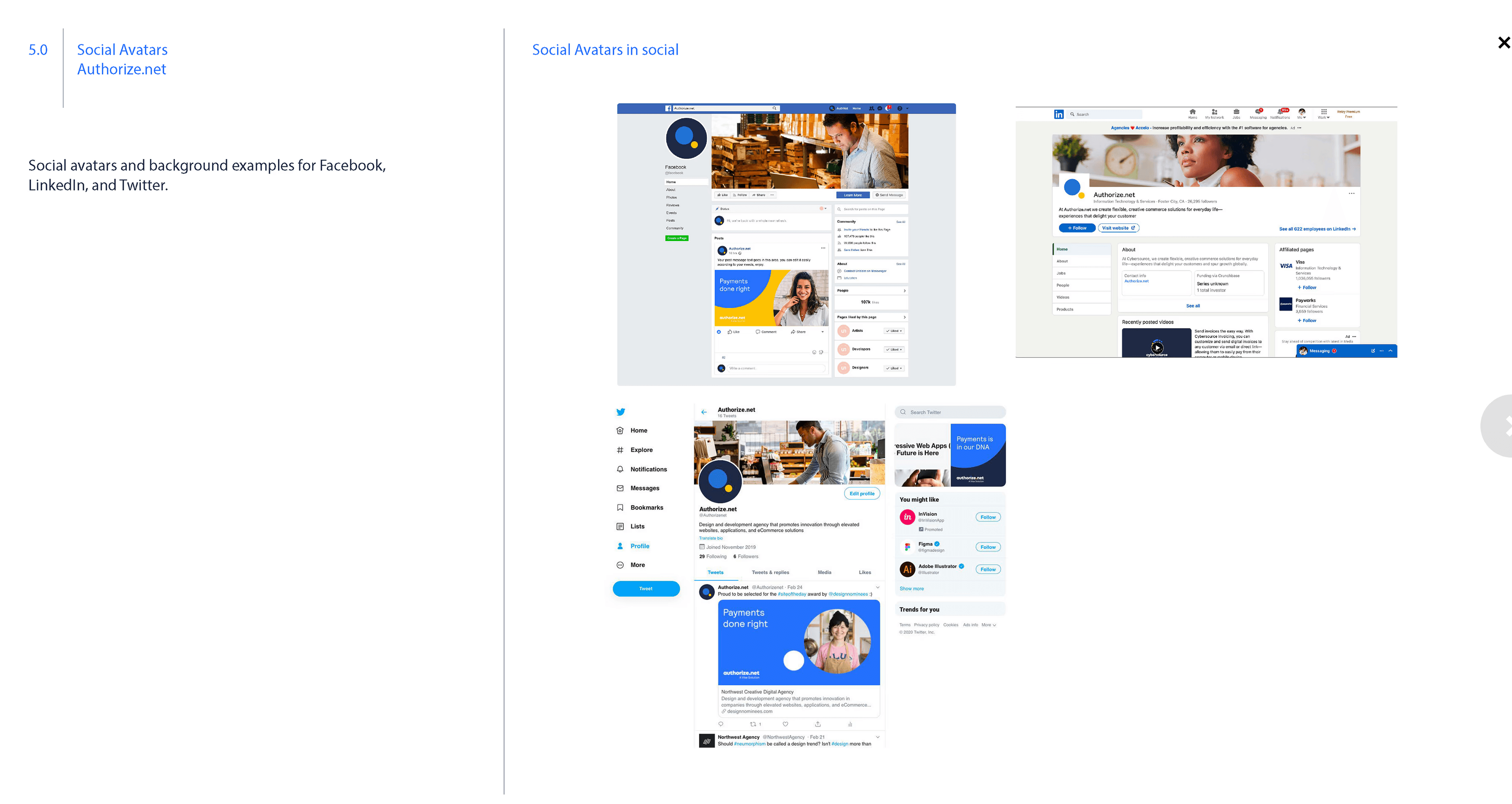
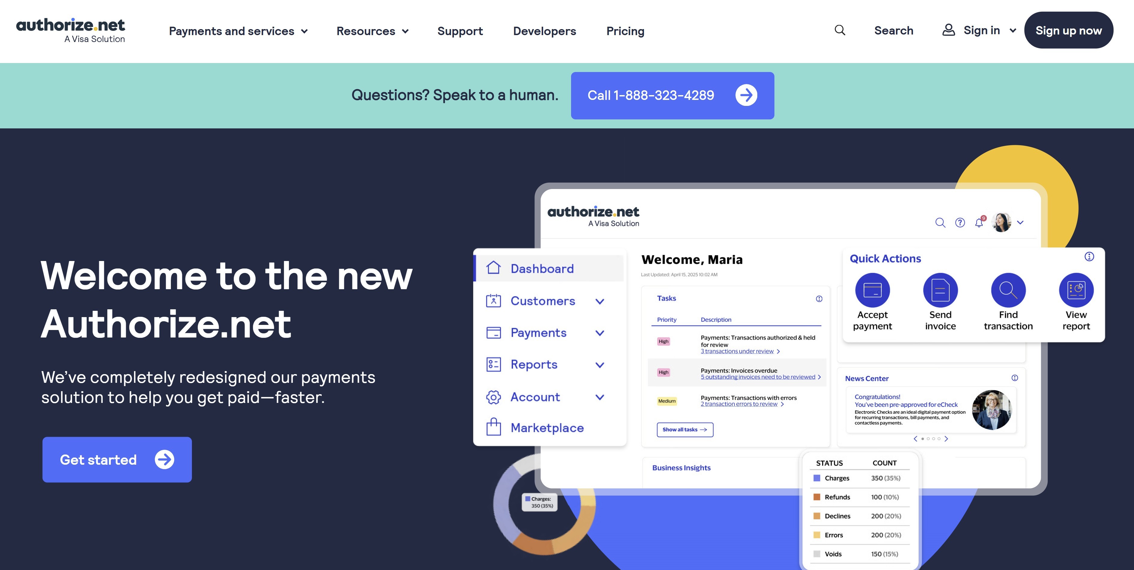
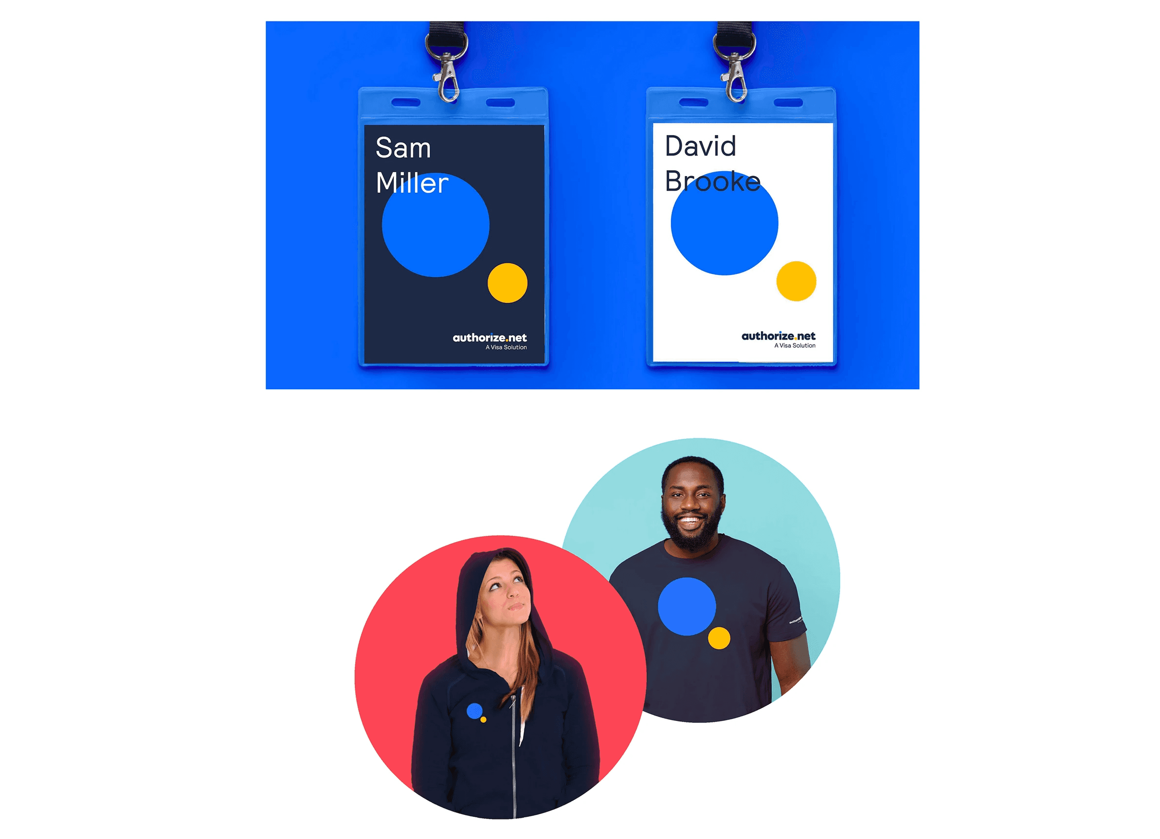
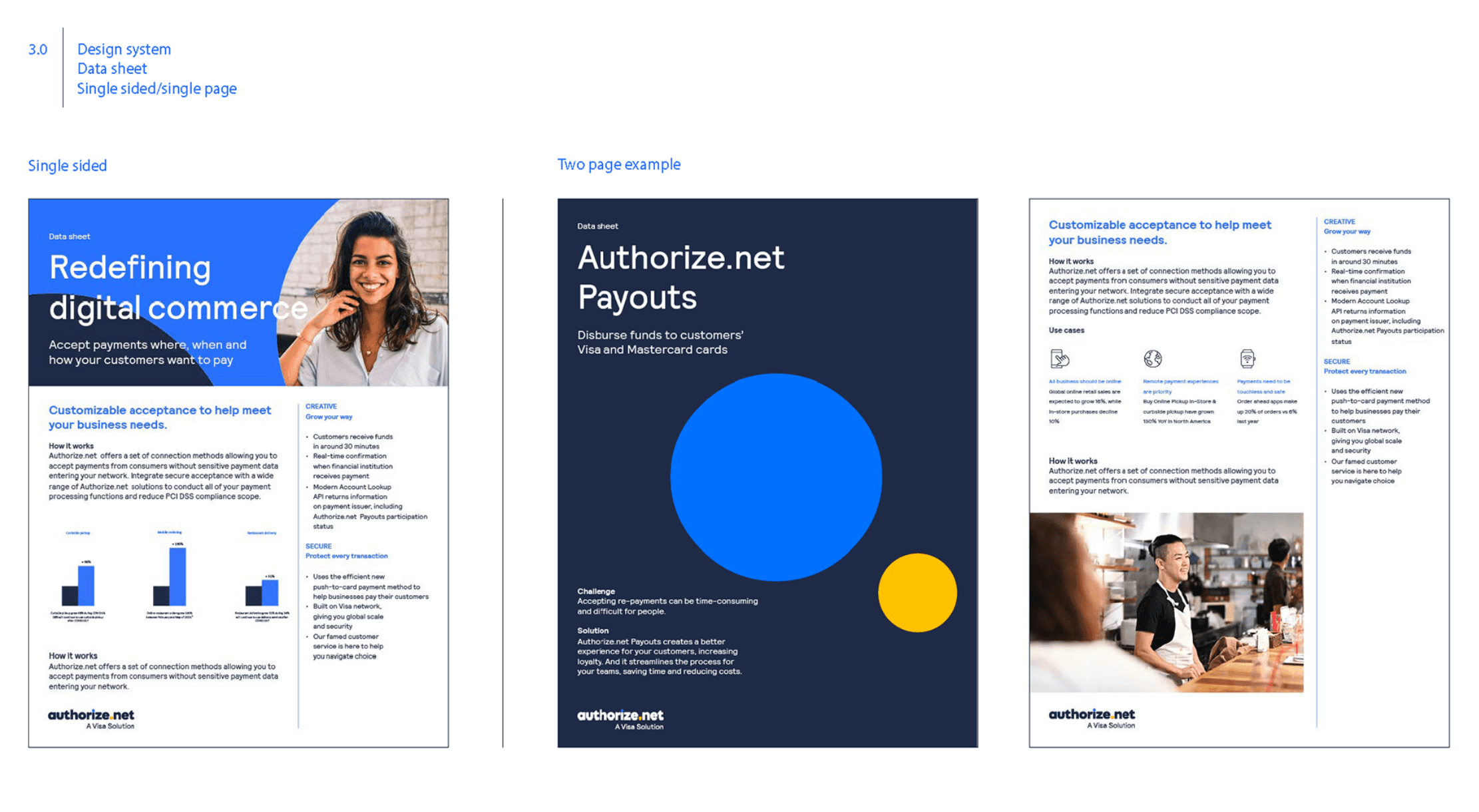
Comprehensive Design Comps – producing real-world applications, from datasheets and marketing collateral to digital experiences.
Brand Guidelines – developing a complete brand book covering logo systems, usage rules, typography, color, and overall design direction.
Creative Process
The redesign began with an audit of Authorize.net’s existing brand assets and a comparative analysis of Cybersource’s new identity. My goal was to create a visual dialogue between the two brands—ensuring cohesion without diluting Authorize.net’s individuality.
I iterated through multiple logo explorations, testing scalability, legibility, and emotional tone across applications. From there, I crafted color palettes and typography systems that conveyed trustworthiness, innovation, and accessibility. Using comps and prototypes, I tested how the new identity performed in market-facing contexts, ensuring adaptability across datasheets, websites, and customer-facing assets. Finally, I codified everything into a comprehensive brand guideline system to ensure long-term consistency.
Results
Delivered a complete rebrand package for Authorize.net, including logo, visual systems, and guidelines.
Established a unified design language that aligned with Cybersource while giving Authorize.net a distinct identity.
Produced market-ready assets (datasheets, collateral, digital comps) that immediately reinforced the refreshed look.
Provided scalable guidelines that empowered internal and external teams to apply the brand consistently.
Conclusion
This project demonstrated the ability to lead an end-to-end rebrand, balancing creative exploration with strategic alignment. By designing a complete identity system, I positioned Authorize.net with a modern, professional, and cohesive brand presence that resonated in the marketplace while maintaining synergy with its sister brand. The rebrand not only elevated visual consistency but also created a foundation for long-term growth and recognition.